Void, drawing, time, space and colour
I wrote this essay in late 2020 for the Art Gallery of Western Australia’s WA Living Artist Archive as part of its AGWA Foundation COVID-19 Stimulus Package for artists in the State Collection. I’d like to thank the Art Gallery of Western Australia, AGWA Foundation and the Government of Western Australia for their support during this difficult time.
All art starts with a void: the page is blank, the video is a black frame, the gallery space is empty, music begins with silence. The composer John Cage’s famously silent 4’33’’ consists of nothing but this void, which of course is populated to some extent by ambient sound. The question of duration in this piece of music is critical. Couldn’t the performance, such as it is, continue indefinitely? Boundaries to images serve a similar function to the duration of a performance, though their relevance is more to space than it is to time.
To draw is all at once to delineate an image, to make symbols, and above all, to pull an image from the void of the surface
When I look at the blank surface of a canvas or piece of paper it always seems to me that I’m looking at more than simply an object. With just a few lines I can make an illusory space. This space can extend infinitely; to me, it seems very like cosmological space. When we look at stars in a night sky, they really do look like marks on the inside of a sphere, which is to say, a two dimensional surface. We say things such as “Jupiter is next to Saturn at the moment”. That’s nonsense: we know the distance between them is immense, but that knowledge was hard won. Like the night sky, the void of the picture surface, the picture plane, is already both completely flat and infinitely deep before I make any intervention. If the void is the starting point, then drawing is the first step.
In learning new languages, it has struck me again and again that words for drawing in each language capture a multiplicity of ideas. This has in turn led me to reflect on the terms in English. The word drawing, in the sense of an image, or the making of an image by hand, is intriguing as both a noun and as a verb. It is part of our Germanic vocabulary, and originally it meant simply to pull something.1 Drawing may have a Germanic origin, but in German itself the terms for drawing are completely different. The noun is Zeichnung, and the verb is zeichnen, both of which are related to Zeichen, meaning a mark, symbol or sign. So in German to draw is to make symbols or marks. As far as I know, English is unique in having the connotation of drawing as pulling something out of an image. Perhaps the original sense was to pull a pen along the paper, and in this sense the word seems closer to the French dessin and Italian disegno, to which the English word design is related; the original meaning was something delineated or traced out. To designate is a related verb in English, which is interesting if we look at the Chinese character 画/畫 (huà), which can mean as a verb, depending on context, to paint or draw; to delimit or differentiate; to assign or designate; and as a noun, either a picture (whether painting or drawing) or the stroke of a Chinese character. Historically, there was no distinction between drawing and painting in Chinese culture.
The sense of time within the image is distinct from your own but related to it
Where does this little excursion into philology lead us in our understanding of what drawing is? We’re left with a network of related meanings. To draw is all at once to delineate an image, to make symbols, and above all, to pull an image from the void of the surface. In traditional Chinese painting, the white void often remains an integral part of the image, with forms emerging from its infinite space. Calligraphy sits on the picture plane, emphasising its flatness, and is placed so as to complement and balance the composition.
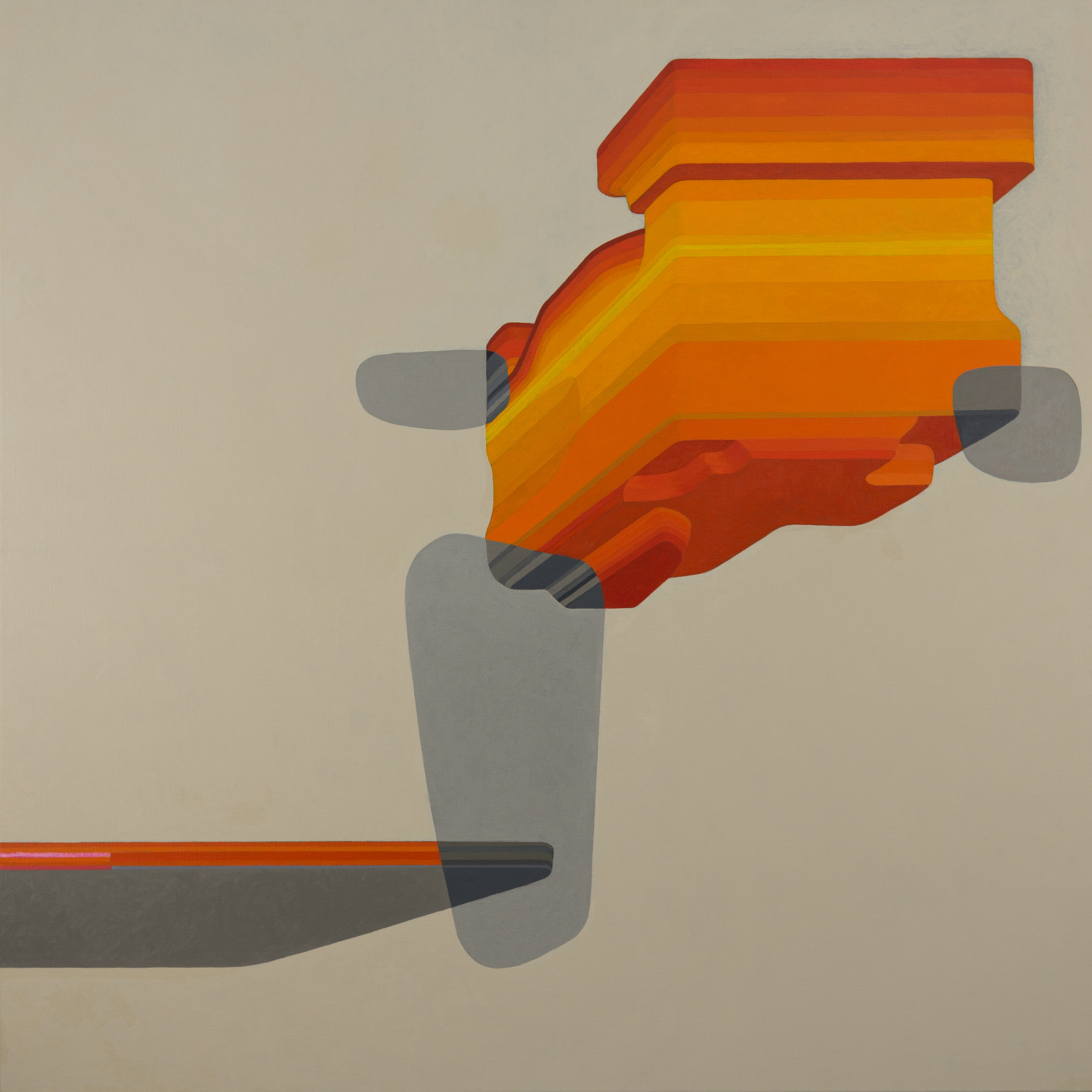
My painting in the State Collection, Below is above, has a pale, warm, and completely flat background colour. The three dimensional forms either sit in front of this background, or within its infinite space. These geological elements are derived from the banded iron formations found in the Pilbara. Their flat frontal faces sit either on or parallel with the picture plane; the picture plane itself is emphasised by three rounded forms, which appear transparent. Aside from the lack of textual meaning, these rounded forms serve a similar function to calligraphy in a Chinese painting.2 Having since learned both some Chinese and some calligraphy, my approach to these marks would probably be a little different today. There’s nothing I regret about this painting, but our minds are like geology: they acquire new layers, change shape, and reform.
So what kind of space is drawn out of the void in this instance? The space within the painting is constructed using linear perspective, with the one vanishing point situated at the lower left corner. Since the vanishing point in this form of perspective represents the eye-level viewpoint of a virtual observer directly facing the scene, this viewpoint is displaced, with the lower edge of the painting effectively functioning as a horizon line. Conventionally this vanishing point would be placed at the centre of the horizontal axis of an image. In the act of looking into the space within the painting, your vantage point is moved to the periphery and you look up at the scene, without any firm reference points. This is where the boundary of the image becomes crucial. The painting suggests or implies an indefinite space beyond itself, but its expression within the square format is crucial.
It’s tempting to suppose that a painting, being a still image, does not necessarily involve a sense of time. When we think of time in painting, we might imagine something with a literal representation of time, such as Duchamp’s Nude Descending a Staircase, No. 2 or perhaps Piero dell Francesca’s Legend of the True Cross. But there are two fundamental ways in which painting involves time. For one, all images involve a sense of time. For another, there is the viewer’s time. The latter is inseparable from the viewer’s space: you move towards or around the painting (or any work of visual art) and this takes a certain time. You might stop for an interval, at a certain distance, looking at (and into) the work. You might walk backwards and forwards, perceiving different qualities as you do so. The sense of time within the image is distinct from your own but related to it.
So let’s turn to the sense of time within an image. The sense may be of a passing sequence or it may be of an indefinite duration. The indefinite duration is the more interesting to me, as it functions very like the void of the flat picture plane: it is at once an infinitesimal and an infinite duration.
Below is above also refers to geological time. Geological formations are typically ancient in human terms, and the banded iron formations of the Pilbara are amongst the most ancient of all, dating back around 2.3 billion years ago.3 This is certainly an unimaginable depth of time, comprehensible only as a number. Rocks literally embody deep time.4
The colours of Below is above are derived from those of the Pilbara, especially the widespread iron oxides, but are treated in a heightened way. Colour is a central preoccupation for me. More often than not, the colour in my work is vivid, though it’s important to note that a colourist approach of the sort that I take is not necessarily about bright colour. Colourism is usually contrasted with a tonal approach to painting; the latter is more concerned with light and dark values, whereas colourism is primarily concerned with the relationships between colours. The relationship between colours is both between (and within) adjacent areas and across the composition as a whole. The desired result is a kind of cohesion. There is a certain emotional quality that I’m looking for, which is difficult to describe. What I can say is that to me, the test of a good colour relationship is that adjacent areas sit together, emphasising the surface. The spatial illusion is built into this flatness, which is of course related to the initial void.
And so, via colour, I return to space. It is clear, I hope, that the dimensions of void, drawing, time, space and colour are braided together in a closed loop. The perceptual, formal and conceptual aspects of my painting are similarly interlinked, and equally inseparable.
Notes
- Obviously that’s another meaning the verb drawing still has; to drag is related.
- The shapes of these forms refer obliquely to certain calligraphic strokes, specifically the horizontal 橫 (héng), dot 点 (diǎn) and vertical 竪 (shù).
- They have also an organic origin. The first photosynthesising life in the oceans caused iron oxides to precipitate to the sea floor—building the Hamersley Ranges, from which both iron ore and the deadly asbestos at Wittenoom have been extracted. So this ancient phenomenon has a very tangible impact on our life in Australia today. More importantly, the same organic process completely changed Earth’s character. The oxygen we breathe and the resulting blue skies we live under entirely owe their origin to what scientists refer to as the Great Oxygenation Event.
- We also have the illusion that they somehow sit fixed outside time. This might be one reason why the theory of plate tectonics met fierce resistance in the last century.